We are very excited to finally share with you what we have been working for the last couple of months. We have made several changes and improvements to the way menus are organized, aiming to simplify your day to day work and ease new users into our system!
So whats new?
1) Clog-free Menu page
One of the main things we wanted to fix is the look of our main menu. We got rid of all the different sections we had on the main page that made it hard to navigate on mobile and at times a bit confusing.
Instead you will see an “Alert” menu that will list your daily sales totals, chart positions of your best selling tracks, pending invoices, new demos and approved connect deals etc. You will be able to quickly and with minimal scrolling access the information that matters to you and get going with the rest of your day, or if you like detailed data you can click on “View More” to see, well, more.
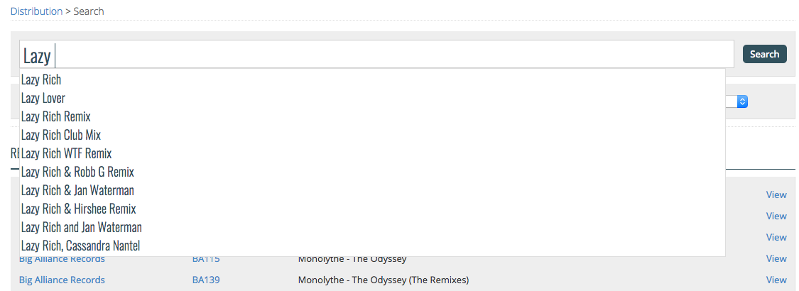
You will also notice a newly added “Search” bar that will allow you to search for anything and everything within your account. For example if you search “Lazy Rich” it will bring up all releases, tracks, invoices, royalty reports, help articles and blog posts that include his name in an a quick and organized way.
On the main menu you will only see the Search Bar, Alerts Menu, Quick Start Menu and Site Updates (the latter two, which you can hide if you wish).
2) Improved Search Functionality and Suggestions
As mentioned above, you may have noticed the Search Bar in the main menu. The best thing about it is that you can use that option in the Distribution, Promotion, Accounts and Demos sections and it will only bring up results relevant within that section.
We also added suggestions that will show up as you type what you are searching for, that will come in handy when you wish to have your search as detailed as possible. For example, if you are looking for a “Lazy Rich Remix” or “Lazy Rich’s Super Club Remix”.
The main thing we wanted to make sure of is that it is fast and reliable so give it a shot, we think you will find it very useful!
3) New options to list or organize your releases under Distribution, Promotion and Accounts.
The main Distribution, Promotion and Accounts pages have been re-organised into distinct section, with the appropriate alerts, navigation and help text. Releases for each section have been moved to their own page. We have added multiple ways you can list or organize your releases, we understand everybody is different in the way they like to handle their work and access their data so we wanted to make sure you had options. Once you select the one that fits you best, the system will always show you that view, you don’t have to change it every time you visit the page.
a) List Display vs Split Display: List Display (default) will show all of your releases in the order which you decide regardless of the status of the release while the Split Display will list releases based on the status of the release. For example, under the Distribution Releases section it will list them under the following sections: Ready For Submission, Online Releases, Offline Releases, No Distribution Access.
b) Detailed View vs Reduced View vs Minimal View: You will also get access to different types of viewing options, for example, under the Promotions Releases section you will get 3 options:
– Detailed View: Shows your stats for each track as well as the overall stats of the release. You can see detailed plays for each track and which track DJs favorited the most.
– Reduced View: Only shows stats at a release level. You will see how many promos were sent, how many were viewed, how many were replied to and average rating.
– Minimal View: It will remove the additional stats and will only list the artist, the name of the release and UPC code. You would only access stats once you click on “Feedback”.
c) Sorting Options: You can now sort your releases by Date (default), Newest, Label, Catalogue Number, Artist, Title and UPC.
4) Smart Help Text
This may be a small update but could turn out to be the most useful additions yet. You will now see boxes through the site with a question mark (?) that can give you quick access to answers to Frequently Asked Questions without leaving the page!
Mouse over the question mark for the question and click on it for a “pop-up” with the detailed answer to it.
Please feel free to email us your feedback, we love to hear from you guys!


